Wednesday, October 29, 2014

Some Interesting Ideas

Jurassic Park opens its gates

The title pretty much says it all.  Jurassic Park was on Ideas's verboten list for a while but with LEGO gaining access to the Jurassic World line, it looks like the projects are welcome back to Ideas as well.  There has been quite a rush of project, not like Doctor Who of course, but you can't miss it.

There are some impressive projects to date, but as most are "car" or "car + prebuilt dino" I don't see much of them getting out from under the cloud of  inevitable discovery.


Return of some classic Pirates!

Skull Cove. RedBeard's Return!
by DarthKy

This is another project by DarthKy and myself and I am extremely pleased with the result AND the community response!  1000+ support in less than a week for a LEGO Homage is a rare event on Ideas.

Darthky and I tried to create a non-ship pirate set that would appeal to hard-core LEGO fans looking for more than the standard sets provide and I think we have delivered on that mission statement.
Darthky implemented a map table that just blew me away the first time I saw it. Really great parts usage.

It was also a lot of fun taking the classic figures of our youth and re-imagining them with modern levels of detail.

Of course, with a whole new Pirate line coming out in just a few months, and Pirates of the Caribbean on the horizon, we realize that these are pretty rough seas in which to launch our venture, but we will have fun with it anyway.


Pick of the Week


REVENGE - Frigate class shuttle (Galaxy Command)

I have a soft spot in my heart of the Galaxy Command line on Ideas.  I was invited to help on some of the renders in the early projects but my responsibilities, LEGO and Non-LEGO both have required me to step back.  However I still respect the group and love to see them come out with more content.

What is Galaxy Command?  Well, it is a MOC series that has been produced on Ideas with aspects of it crowd sourced to the Cuusoo/Ideas community.

In many ways Galaxy Command reminds me of that webcomic you have been reading for years.  If you dig back into the archive you can see where the creators were learning their style and how to basically get the most out of their art.  With GC you can see how the quality and style have continued to develope.

This  "Revenge" is the culmination of GC to date with a compelling, rendered design, great background, and eye catching logos and designs.  It has a very tough climb ahead of it though both in support and review as "generic space ship" does not tend to do well on Ideas, regardless of execution. 


Honorable Mentions


Jurassic Park

Extremely happy to see the return of this project now that Jurassic Park is back on ideas.

Marvel's Agents of S.H.I.E.L.D. "The Bus"

Great figures and an ambitious set concept!

I must say however that I think the execution of the set could use a bit of work.  One of the most difficult aspects I have found in creating a solid "Ideas proposal" is pairing the right set with the right figs.

In this case, I feel that too much is being attempted in one design and unfortunately, both the aesthetic and the playability suffer for it.

The "Bus" can't look as cool as it might because it is housing a ton of playable scenes and the playability of the scenes (the rooms inside the Bus) are less accessible due to their integration and support of the  Bus framework.

That being said, the base concept is a compelling one and sure to draw fans of the show.

Holiday Gingerbread House

A fun concept that has a good chance of getting produced some day, if not through this project, then another, or perhaps LEGO itself.  Personally, I find the idea that most gingerbread houses are the same scale as LEGO minifigure houses too much fun of a coincidence to pass up for long. 

While I would prefer this model to not be specifically based on an existing Winter Village set, there is technically nothing wrong with it, and the muggles are certainly not likely to judge based on that criteria. 

The Stolen Ship

A novel design for a classic pirate ship!  There is a clever technique where the hull pulls out like drawers, check it out.

The Bat Spaceship! (Patent Pending)

Sometimes a single feature, not even related to the build, can really promote a project.  With this one I really love the integrated Batman and LEGO Space symbol.


Notables

Spooky Cemetery!
by saabfan
A well presented project.  I think the fine details of the project however need a bit more kick to be a real candidate for 10,000.
Lord of the Rings: Rivendell diorama
A gorgeous build with phenomenal technique!  I am afraid its shear scale might scare away potential supporters though.  
Audi R8
A well executed design.  The passenger area is especially well done.  If it has a smoother look it might get a bit more traction.  
Cloud City
by VAkkron
An extremely impressive LDD design!  I do question the playability of the build however.  There is a lot of content inside the build that I would question the accessibility of, with issues similar to that of the Shield project listed above.  

I would perhaps suggest something akin to the Deathstar, where the playscapes are  fully open on the side instead of top down. 

Fairy Tale Modular Set
by jrbony
These are amazing designs and, where they individualized I would not hesitate to support them.  As is however I find this project too similar to the faults of the mini shop series project: uncertainty in which aspect is being supported and too many divergent IPs in a single project.


Cubical World
A nice clean office design.
Micro-Dinosaurs
I could have a lot of fun with microbuild dinosaurs.  It cold be a great building lesson as well. 
Voyager Mission
by LuisPG
A well done Voyage, and well presented.
LABYRINTH
In interesting take on turning the movie into a set. 
Micro-Scale Space Dart I
by Colin23
I have always though that microbuilds along this design concept are a great idea. 

Wednesday, October 22, 2014

Brickstarter: Mouse Guard

https://www.kickstarter.com/projects/crazybricks/bricks-of-the-mouse-guard-for-your-miniature-figur


Guy Himber is at is again with his crowd funded "Crazy Bricks."

This time around the subject is Mouse Guard, an avant-garde comic series set in a world much like our Earth but instead of humans being around, you have sentient mice. Not giant Mickey mice, but your standard scale mice with minimal physical anthropomorphism. 

It is certainly an interesting read and the art is quite phenomenal. You don't have to take my word for it as it is an Eisner award winning publication.

Well, back on point to why we are all here. Himber is crowd sourcing the production of minifig compatible Mice head for minifigs and a variety of medieval weapons.
I gotta say, I love it when minifigs are presented as "actual size" and Guy has proven he can deliver on these kickstarters.

Wednesday, October 15, 2014

Some Interesting Ideas

News


I have two additional articles that might be of interest to FOLS this week.

  • An interview with Alatariel, the creator of the Research Institue.   We discuss her history with LEGO, her experience with the project, and her thoughts on LEGO Ideas.
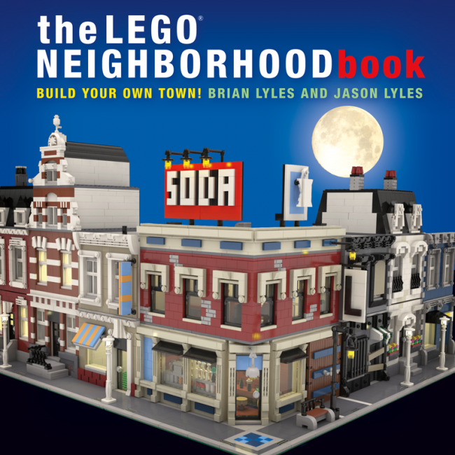
  • An in depth review of The LEGO Neighborhood Book.  I would recommend this book to any FOL, but especially to those trying their hand at a modular on LEGO Ideas.


Pick(s) of the Week

This is one of those rare weeks where I could not decide between two great projects.

Concorde Display Set

The Concord is one of those modern marvels that, like manned moon missions seemed to be the start of something new and spectacular, a new era,  but unfortunately stands alone (well, nearly alone) as a singular front runner. 

I think, like the DC-3, that these detailed aircraft builds could be a way for the classic non-LEGO model building community to transition to the interlocking bricks that the kids are much more into these days.  Additionally LEGO could bring aviation geeks or avgeeks (their term like our FOL) that don't have the time or skill to build classic models into the LEGO fold as well due to the ease with even a complete novice can execute a LEGO set.

As for the model itself, I like it a lot.  The heavy studding of the wings is a bit of a negative but there is really not much you can do about that.  The addition of the Bristol Olympus engine is a great touch to set this apart.

As usual ABStract expertly executes the presentation of the main image with an attractive model, background, and titling.

As for the audience, although this is an retired aircraft this is a pretty good choice.  You have this transcontinental appeal (North America, UK, France, and even Barbados), you have an in with avgeeks, and as an engineering marvel you have a lot of engineers that identify with the craft.  


Little Red Schoolhouse
by tdh-br

If you are a serious LEGO fan, make sure to really check this project out.  At first I was not expecting much, but as I really examined it, it went from notable, to honorable, to a shared "pick of the week."  Like the Food Truck, this project really exemplifies the subtle excellence you expect in an official LEGO model.

Excellent model at the perfect scale that really nails the image people have of the tiny red brick schoolhouse.  The roof is also extremely well done and quite efficient with part usage.  I love that the structure is off angle as well, though there are more officially acceptable ways in which to execute it.

I really love how the project basically nails all the critical points without excess.  That is extremely difficult for even experienced FOLs to pull off.   At the same time there is attention paid to even simple part placement.  For example, the pillars are turned 45 degrees off standard to give them a bit of a pop.

The Bus is a nice accent and gives us that vehicle that nearly every LEGO set needs.

The only problem is I am not sure about the global appeal of this image of an "old school" school.  I think of it as very "North American" image and not just because of the U.S. flag integrated into the project. 

Honorable Mentions

Steampunk Betty (Emerald Night Redux)

A fun build that leverages a classic set.  Very clever.  I like how the mecha is clearly embracing the train motif, not just using parts from the Emerald Night but also trying to evoke the design itself.

I think the legs fail to live up to what the rest of the build is delivering.  I also think this project might be the ignominious winner for "most tags on a single project."

Versailles 1668
by Djeaser

This build is not quite so huge as a first look might imply.  Micro scale on a grand scale!  Not quite sure where I would display this but it is simply gorgeous.

Pictorial Map of The United States
by mmbace

Love this for all the same reasons as the European model.

As someone who grew up in Wyoming I feel inclined to give my two cents: Add a reference to Yellowstone, perhaps Old Faithful.


Notables

Project Voltes Five (Voltes V)
Only vaguely familiar with Voltes but this project has done a great job of accessing the subject fan base.
Lego Indiana Jones and the Last Crusade
With all due respect to Konrad Keska and the project supporters, I must admit that I am not too impressed with this set concept.  It would make a mind blowing MOC, and I certainly appreciate the work, but it falls flat for me as a product.

First off, the structure in the main image, is large and thin with no minifig play value other than, well, going through the entrance.

If it was by itself I could see it working out okay as a display model propped against a wall, but still the whole structure only gets a few minutes time in the movie and it only serves as the entrance and exit to the movie's last sequence, in other words, it is a lot of bricks and volume to display something, though assuredly pretty, is technically irrelevant to the film and story.  I feel the same way in regard to the Lars homestead.  It is a desert igloo where that whiny kid Luke lives before all the cool stuff happens.

But, despite the main image, there is actually a long sequence of traps and such from the movie attached to the back of this build.  So, you have this inherent setup problem.  Where are you going to put this thing.  When you are considering a design you hope to market you need to do a thought exercise where you try to picture where someone is going to put the set to showcase it.  Generally people only have a few location in their home that are appropriate and they tend to only have one good viewing angle.  So in order to see the sequence of traps, all you see is the back of this really tall, thin, wide structure.  If you display it with the pretty wall face out you end up with this awkward facade hanging out in space with a thin, long hard to see structure pushing it out from the wall.

Now, on to the "action sequence."  This is also problematic.  This structure is basically a canyon build.  It is long with two sides, the problem being that everything of interest is inside the canyon.  This obstructs the view and lighting and  is an impediment to general playability.

As a comparison lets look at the action sequence set from Raiders.   


You can see that one side is open.  The circumstances of the sequence are the same: Characters going down a long tunnel of traps and challenges, but in this case, LEGO has created an open diorama.  This has a much wider angle of playability, and view and has a very photogenic view angle. 

King Arthur & the Knights of the Round Table
Well presented and executed.  The figure count does seem a little high though but I would like to think that fans of the project and LEGO would be receptive to scaling down a project of this nature if that was required.
Music School and Instruments Music Store
by max78tn
An interesting concept and fairly well executed.  I think you need something really astounding to warrant a four story modular.  This could easily be condensed.
Huckleberry Finn Diorama
by mpoh98
Beautiful.  I would not know this is Huckleberry Finn though if you didn't tell me.  This one certainly deserves an image title.
The Hobbit: Troll Barbecue
by saabfan
Similar to the Huck Finn one above, at the scale of the thumbnail for this project I might not have realized this was the troll sequence from The Hobbit.  However, with the integrated image title, this is much more likely to get fans to click through. 
Hogwarts Castle Micro
A nice reboot of Scorpius's earlier version.
Modular Bank Robbery
Clever idea to have a story integrated into the modular.
Lego | Arkham Knight | Batmobile
Not too familiar with the Arkham Knight Batmobile but the design here is very compelling.  Glad to see the use of text in the main image stress the subject matter.
Santa's Sidecar (featuring Rudolph Red Nose 5)
I really love the X-wing Reindeer in this. 
White Lake House
A well executed design of modern architecture. 
Kenworth W900 Road Train
An impressive truck.
The Hobbit - Halls of Thranduil
I like this build.  It has a lot of unique character, especially the "antlers" on the throne.

I don't care for how the pictures for the project are sorted though.  The first six images are for a much larger, over the top, "Canceled" version that detracts from the quality of the more elegant project.  I don't exactly mind that they are included, but I think it would send a more consistent message if the "cancelled" images were after the main concept.

Turtle CS-1 and the Space Guys
While I love the turtle on this Ideas has specifically prohibited "Battle packs" or sets that are predominantly figures. 

I therefore find it quite surprising that Ideas confuses the issue by allowing a project that actually refers to itself as a "battle pack" in the text.
Spaceship
by Sevalgo
A great design magnified by an excellent presentation.
Rolling robot - PALLA
Personally I love this.  But I don't see much point for it to be LEGO.  By its very nature it is a sphere.

I love dynamic projects that I can figure out how to change into something different while leveraging the animatronics that the build introduces.

Adding anything to this sphere will basically break its function.  So, awesome concept, but I can't see a way to leverage the design.
Gym Equipment
A lot of well designed equipment.    
Corner Doughnut Shop
I like the concept of a Doughnut shop and the internals are well done.  The outside is impressive and well structure but I would like to see some more color for a doughnut shop.
Aria Space Station
This is an impressive build.  It is unfortunately sullied by spam tags: Star Wars? Star Citizen?  Piano?    
HMS Romulus
The right background and some basic rendering help a space ship stand out.
Batman Beyond Project (75 Years of Batman)
An impressive build of the future batmobile.
Robinson Crusoe
A great example of an impactful main image.  The right render and custom figure could would have made this stunning.
The House
A lot of detail and surprisingly impressive builds hidden behind a low-rez render and a horrible background.
Stage for Rock, Jazz and Metal Band
Your main image is critical to selling your project.  This project offers so much more than the main image implies!

Tuesday, October 14, 2014

Book Review: The LEGO Neighborhood Book

Modulars are very popular on LEGO Ideas and, in reviewing ideas projects I occasionally get emails asking why I didn't showcase one modular or another...the specific details vary but it is almost always because the presented modular lacked the touch of flair and attention to detail that makes the official LEGO line so popular with even the most casual FOLs.

Some will press on with "well, how do I make it better?"  Historically my response to this question has been "Make a build like the official modulars but redesign it to highlight your subject matter."  Useless advice right, but what else can I say?

Well, now I have a new answer: Get The LEGO Neighborhood Book by Brian and Jason Lyles.


Overview  

I was not quite certain what I would find in this book, but I have admired the Lyles brothers' Chili's Restaurant in person so I was expecting to be impressed and that I was.

The majority of the book, about 60%, is dedicated to instructions for a Drugstore and three modular houses in various styles.  The rest of the book contains advise, mostly in a lead by example format, on how to design your own modulars. 

I am going to discuss this book working from the concrete content (the instructions) and work my way towards the more esoteric content (design suggestions)


The Drugstore

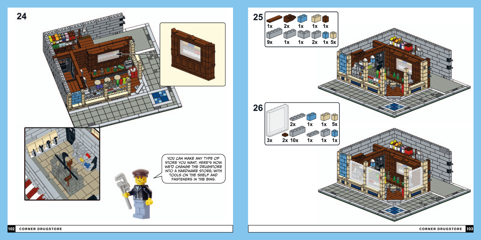
The Drugstore is a two story corner modular.  The first floor is a drug store with a bar and big windows.  It has a back room with gated access for delivery vehicles.  The second floor is reminiscent of red bricks with a fully equipped apartment on the second.  There is no roof access with this modular but there is a nice billboard and some air conditioning equipment.   


While the entire build is noteworthy three features really stood out for me:
  • There is a really fantastic display case behind the shop counter constructed by snotting a door frame on its side in front of an array of bottles.  (see the picture below)
     
  • The shop has a loading dock with large double doors.  A great touch that is unique to this build.
  • The second floor apartment manages to contain a bedroom, full bathroom, kitchen, and living room on a single floor.  A pretty impressive feat given the limited floor plan. 
The book also briefly showcases alternate signage and shop floor for creating a hardware store instead of the drugstore.


The Houses

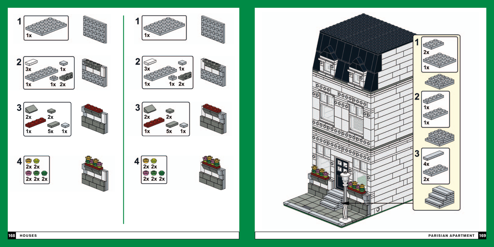
The last 30% of the book is dedicated to three houses: a Parisian, a Colonial, and a Canal Ring.  Now the real beauty of these design, a real stroke of brilliance, is that these three houses are all snot-on facades snapped onto a functional base model.  

The basic model is designed on a 16 x 32 plate with the traditional 8 studs for the side walk and 8 studs in the back for a yard.  The structure has a door to the front and the back, and four windows on each floor and a pair of attic windows.  

The critical factor however is that the structure has an array of forward facing studs on the top and bottom of each story as well as around each window.  

The book then shows how to create a snotted Parisian, Colonial, and Canal Ring facade to snap onto these studs.  

This is a really inspired way to explore a variety of Modular styles without breaking the bank or burning time creating brand new structures from the baseplate up.  

Now these base builds don't take into account the internal framework, there are not even stairs to get from one to story to another, but they serve their purpose of fleshing out an entire city extremely well while letting you concentrate on the aesthetic qualities. 
 
In my opinion this concept of facade modulars pays for the book, especially for any FOL or LUG looking to build big on a budget.

This picture displays the base model with some of the Parisian facade


The Rest 

Although there are a few more instructions sets for minor items, the rest of the book is mostly about designing your own modulars.

In many ways it reminds me of those DIY home design and repair books as it showcases several options and discusses the thought process behind those choices.

In other ways it reminds me of a department store catalog (ah! a bygone era), as it is filled with multiple incarnations of various appliances, furniture, and home decor to choose from.  

Here is a break down of the six chapters:
  • Getting Started with the Cafe Corner Standard

    This covers the details that make a modular a modular: the interconnects, the baseplate, the sidewalk, the stacking, etc...This is probably not news for anyone who would be getting the book for themselves, but is fundamental to setting up the book.

  • The Design Process

    This chapter discusses the use of color and symmetry in creating an attractive modular. 

  • Bricks Everywhere

    This chapter discusses the practice of observing real world architectural elements as specific brick elements.  This is a fundamental skill for LEGO crafters.  In this book, the Lyles brothers use a variety of photos of real world architectural elements paired with very similar LEGO elements to emphasize the practice.
  • The Details

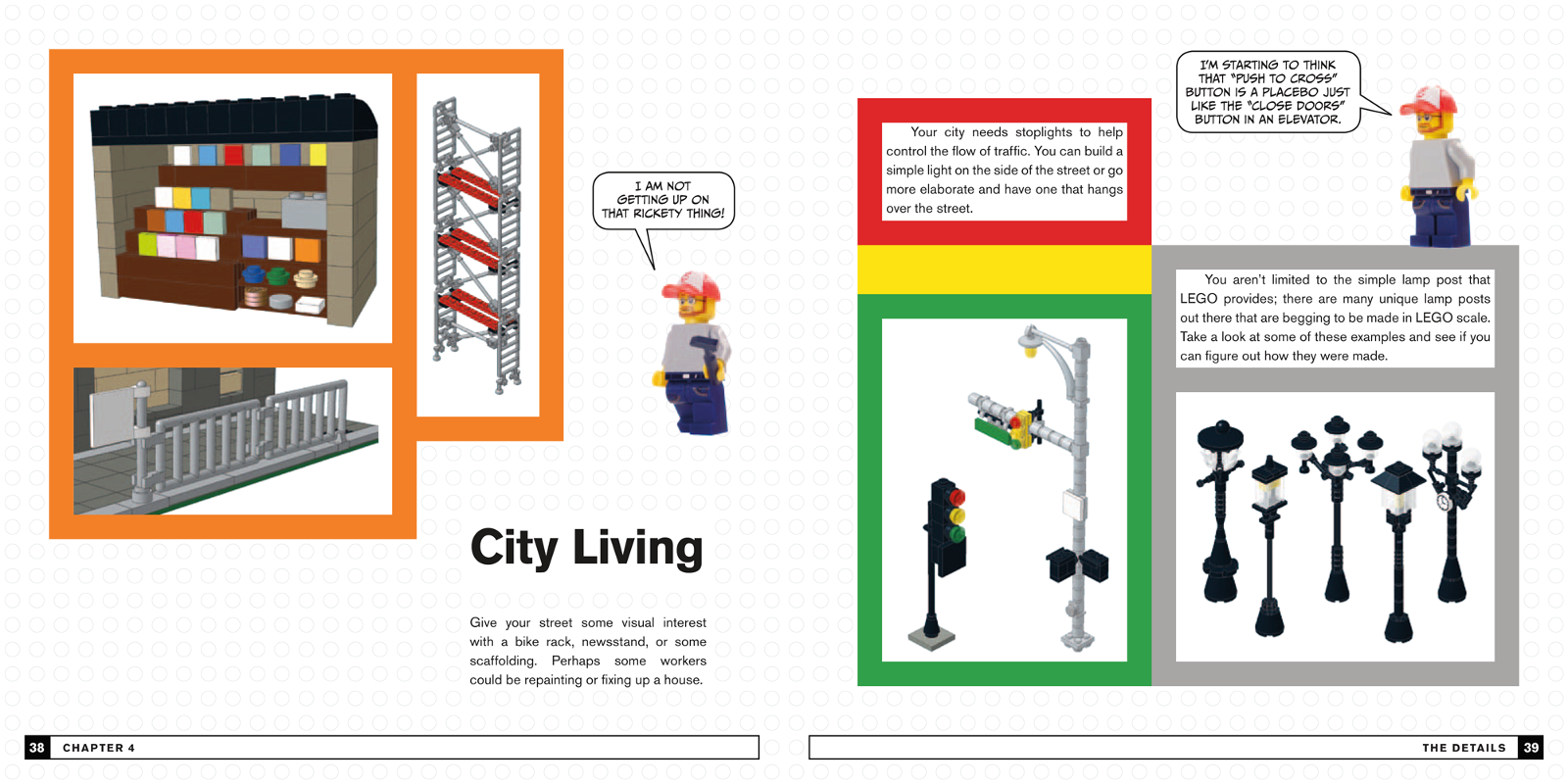
    This chapter displays a variety of ways to orchestrate external details of a modular.  For instance, there are 16 variations on windows with shutters.  For the most part these builds do not come with instructions but they are displayed in such a way that most knowledgeable LEGO fans should be able to reverse engineers the builds.  There is one notable instruction set in the chapter for a very detailed traffic light.
the traffic light and an array of street lamps
  • The Interior

    The Interior is, as one would expect, similar to The Details in format but applies to the furniture and appliances that occupy the Modular.  There are, for example, 20 seats ranging from bar stools to recliners, 7 beds, and 12 night stands.  
  • Modular Building Gallery

    This chapter is pretty much the most straight forward showcasing 21 very creative and well implemented modulars and four mini-modulars.


Round Up

This is a great book for the moderately adept through accomplished Modular Builders.   The less experienced will get some great tips on how to liven up their builds and the grand array of example decor and architectural elements should please even the most veteran FOLs.

Less experienced LEGO builders might have some difficulty, at first, reverse engineering the content that does not have explicit instructions but as long as the don't give up on it, it will actually turn into a great training exercise.

As far as brick budgets go I really love the ideas of the base model with facade introduced in this book.  Since the sides of most modulars are covered up by, well other modulars, and the facade totally covers the front facing support structure, you can implement the base model with whatever brick is handy.  This leaves you a lot more wiggle room, both in part count and price, to work on core designs and giving variety to the modular neighborhood.

The concepts, advice, and examples in this book can really help with not only modulars but also with any build where you are looking to breath more life into your displays.